Friday, August 25, 2017

Select you niche

"Select the niche". A lot of internet marketers like to start with this step. I decide to do it differently because I believe that by explaining the "niche" now you would have a better idea.

If you have been follow my blog from the beginning, you should know it is easy to set up a free blog. No problem if you missed it as you can follow this link to my content page, where you can find a list of my guidance posts sorted in systematic steps so that you can start from the beginning.

Internet marketers call it a "niche". It is a sort of category or segment of the market. If we go through the marketplace, there are millions of different products or services in the market. A lot of them do provide affiliate system that you can help to sell and earn commission. The question now is "what you want to promote?"

Let go to one of the most famous affiliate network Clickbank.com to check out how the products are categorised.


Let click on the following Lazada banner to go to the Lazada website and check on the product category tabs.


There had been a lot of research done by these well known organisations with regards to customer behaviour to finally come out with the category. Hence it can be used as a general guide for us to decide on the niche of market that we want to go into.

There may be some of you who will say, of course I want to promote all products that available. But please remember Rome is not built in a day. Every large plan has to start with little steps. So please spent sometimes to consider carefully and sincerely on what is the niche that you want to start.

Select a niche that you are passion with. I may advise you to select some idea that you will be interested to continue even if it does not give you any monetary benefit. If you really do not know what niche to select, then please click on the banner above and go to the market. Assuming you are going to buy something in the market, what are the items that interested you? Select a few of them and take note on which niche (category) they belongs to. 

By doing this, you are actually checking the items from the customer perspective. Your niche selected must be somethings that your final customers want. With something you selected as a customer, and yet interested you, then you will have a higher chance to fulfil their needs. Fulfilling your audience's need is the final objective of a true internet marketer.

If you still do not manage to decide, then go forward to the following link on Amazon and checkout for more idea.


Alternatively, these books will be a good reference to check out on how to find your niche.


Sunday, August 20, 2017

The outlook of your existing blog

After following my blog over the last few posts, I am sure the following blog outlook looks familiar for you. You should be able to create a basic blog like the picture with the following 5 main features. The may looks different with different setting from you but the basic layout and the 5 features will be as per your setting.

Refer to the red circle number as 1 in the picture, this is the header of your blog. You can use the default image of the theme, with some title you typed in. Or you may have prepare a picture in JPG or PNG format with resolution of 1200 pixels-width X 250 to 380 pixels-high, even with the name of blog writen on the picture.


The red box number 2 is the brief description of your blog which you typed into the description field in the header of your blog layout design page.

Red box numbered 3 is the main body of you blog post. You can set to display 1 or many posts as per your preference by editing the main body section in the layout design page too. Red box numbered 4 is the side column which can be used for various purpose. Please note that the blog outlook of one main column (marked 3) with one right side column(marked 4) depends on the layout format you selected. It can varies depends on your selection.

Finally, the red box marked 5 is the navigation tabs row, which you created and finally select to display on the cross-column below the header in the layout design page. Selecting this "navigation tabs" will display your page accordingly, except the "Recent Post" which I change the name from "Home" to "Recent Posts" in my previous post on Set up pages to be navigation tabs

By selecting the related navigation tab and then scroll down to the bottom of you page, there is a pencil icon which you can click on to edit your page (as shown in the picture below). You can then edit your page accordingly.


In case you do not find the pencil to edit a page, most likely you are not logged into your account and is viewing your own page as a guest. Log into your account and you should be able to find the edit icon of pencil.

After editing you page, you can then click on the update button on the top right coner to update your page on your blog.

By now, I am sure you have had the basic skill of creating and configuring your blog on blogger.com. Do go ahead for some trial and practice until you have the blog outlook that you are happy with. I will let you free to play around on your blog for a while before I come back on my next post.☺

On the other hand, below is a place where you can buy a very good book "Google Blogger for Dummies" in which you can have more detail reference on how to create a very well presentable blog on Google Blogger. Click on the book to find out more detail.

Setup pages to be navigation TABs on your blog

In the last post, I write about how to use the "Pages" function of blogger.com and how to create a few pages. I did advise you to try create a few pages regardless of the content at that time. The main reason of creating a few pages is to make sure that you do have a few pages with title that you are familiar with. These pages will be used in this post to set up a few selection tabs in your blog.

Let go back to the dashboard of your blog. Select the "Layout" function on the side menu. The layout customisation page of your will be displayed. On this page, you would be able to see the now familiar sections of headers, body, sidebar, footers and etc. There is an "Add a Gadget" section that I am going to guide you through today. This "Add a Gadget" section can appear on either the left or right side menu, depending on the layout format you set. You can add a gadget by clicking on this link.


There will be quite a number of different gadget that you can select to add onto your blog. In my post today, we are going to add the "Pages" gadget as shown in the following picture. This is a gadget to customise the display of the pages you created on the last post.


By selecting to add the "Pages" gadget, the following pop up window will allow you to configure the list of pages you had created and published. The Title field (marked #1) is optional. Just provide a name so that it will be display as the name of the a section in the layout view on your blog dashboard.


In the red box marked #2 in the above picture is where you can decide on which page to display on the section of your blog. Take note on the default page with default name "Home". This is a page that you cannot customise but designed to display your blog post in an descending chronological sorting. The newest post will be displayed before the elder post. The default name of "Home" can be edited. I am changing it to name as "Recent Post" in this blog.

As shown in the above example, I selected the "Home"  and renamed it to "Recent Post" together with "Support Blog", "Blog Content" and "About Michael Beh". The "Thank you very much" page is left out because it is to be used for different purpose.

You can drag the selected pages in the red box marked#3 to your preferred sorting order. Please take note on the brief explanation by blogger before the save button that you can move the gadget to header section to display pages title as Tabs of your blog or leave it in the side column so that your pages title will be display as related links on the side column.

Finally, click the "Save" button to save the configuration and you will be brought back to the layout design page on you dashboard.

In the layout design page, you newly created "Top Menu" gadget will be shown on the side column, because I guide you to add the gadget there. You can then drag it to the area below the "Header" section of your layout. Alternatively, if you started of adding gadget with the "Add a Gadget" by the "Cross-Column" Section, the newly created "Top Menu" will be appearing there. And of course you can drag it to the side column if you want.


Click on the "View Blog" link below your blog title and your blog will be displayed as per how your visitor will view it.

Tuesday, August 15, 2017

Create some pages in your blog

Hi, Michael Beh here again to continue on the guide on setting up the Guide on How to Earn Money Online guide.

I am sorry for a delay in this preparation because of busy schedule over last two weeks.

Today, I am going to guide about how to create new pages in your blog hosted on Blogger.com. If you are new to my blog and are not sure on where to start, then go to my Blog Content and start from the beginning in a step-by-step basis.

If you had been following my blog, then you should have setup a blog on Blogger.com. Go to www.blogger.com and sign-in to your account to access the blogger dashboard (or control centre). You should be able to read the name of your newly created blog on the upper left corner of the dashboard, right above the "View blog" function.

On the left column of the dashboard, you should see a column of menu showing various functions of blogger. I am going to guide about the "Pages" function (marked as 1 in the following picture). By clicking on the word "Pages" and selecting this function, All your pages (includes Drafted and Published pages) will be shown on the main display area on the right. You may not have the list of pages on the main area if this is your first selection of the pages function.

Click on the "New page" button (marked 2 in the picture) to create a new page. After you had created a few pages, the title of the pages will be shown as the list below this button. The sample page that shown in the picture below is titled as "Support Blog" and it is marked as 3 in the picture.


You can select the function right below the page title to "Edit", "View", "Share" of "Delete" it accordingly. I notice that the "Share" function here can only share the page on Google+. Nevertheless, this is not a concern to me as I can share it with different method. As for now, just create the pages needed for your blog will do.

After you click on the "New page" button marked 2 in the picture above, the following page editing window will pop up for you to edit you page. Key in your page title (marked 1 in the picture below) for this new page. There is a row of editing tools (marked 2 in the picture below) which is fairly easy to use. The area marked 3 is the body of your page. I am not going to go into too detail on the editing process at this moment because the same editing method will be used when you post your article later. Hence the editing method will be cover in more detail later.


For the time being, simply enter the title and type in some content into the body section. Create a few pages even though you may not have any content to write at this moment. My example that shown to you in the first picture includes "Support Blog", Blog Content", "Thank you very much", "About Michael Beh".

Even though the content is not ready yet, please remember to create at least three pages and "Publish" them by clicking the Publish button. These pages that created here will be used for the next setting process of your blog.

Monday, August 14, 2017

Trying out in auto responder

Life may not be as smooth as planned. A lot of issues creep in this month. Do not manage to have time sitting down and prepare the next step of action.

Meanwhile, I am testing out some function in the auto responding provider that I had just sign up under this account name. Some people may have noticed the profile section on this blog had changed. It is now a form created with auto-responder platform.

If you are not sure on what is auto responder now, don't worry. As mentioned, I am testing it and will show you how to do it in one if the future step.
In order to make your online business grow, this is an essential step. I am trying to get the step clearer before put them down into my guide here.

Sorry for missing out this month and hope that you can understand why the step by step guide is not progress as planned.

Saturday, August 5, 2017

Configuring the blog header

Hi! Michael Beh is here again,

After my last post briefing on how to setup the theme of your blog. let me continue on how to configure your blog's header in this post.

On the left column of your blogging page, you will note a function menu named as "Layout". Click on this Layout function and the layout of your blog, depending on your selection of layout method when you setup the theme of your blog will be shown on the work-space. You can scroll up and down to look at how your blog layout is separated into various sections,

In this post, let us look at how to configure the "Header" section. The steps are easy with three simple clicks as shown in the following picture. Select the "Layout" function, Look for the "Header" section and then click on the related "Edit" button to activate the Header configuration page.


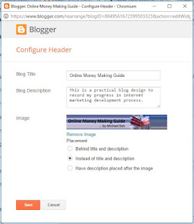
The header configuration is very simple as shown in the following picture. There are only three fields to fill up. The Blog Title, Blog Description and one field to upload your image if you decide to do so.


As a beginner, you can fill in the Blog Title and Blog Description and leave without the image. By saving this and then view you blog, you would be able to try out and understand what you can do to configure your blog header. The title and description you enter here will appear on your blog, with the default background as per the theme you had selected.

When you had gain more experience, or if you are familiar with image editing, you can then prepare an image separately and then uploaded the image in this header configuration page. Remember that the image should have the same width setting as you blog. I did suggest to set the with of your blog to 1200 during the blog theme setup step. If you do follow the same setting there, then your prepared image should also has a width setting of 1200 pixels. This is to ensure that your uploaded image will stay with good fit to your blog.

Below is a book on Amazon that you can refer to beside following my blog on how to create effective blog on Google Blogger.